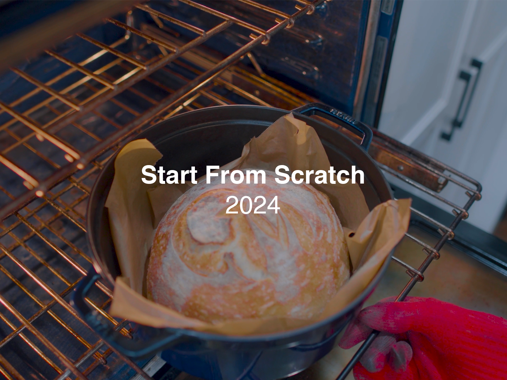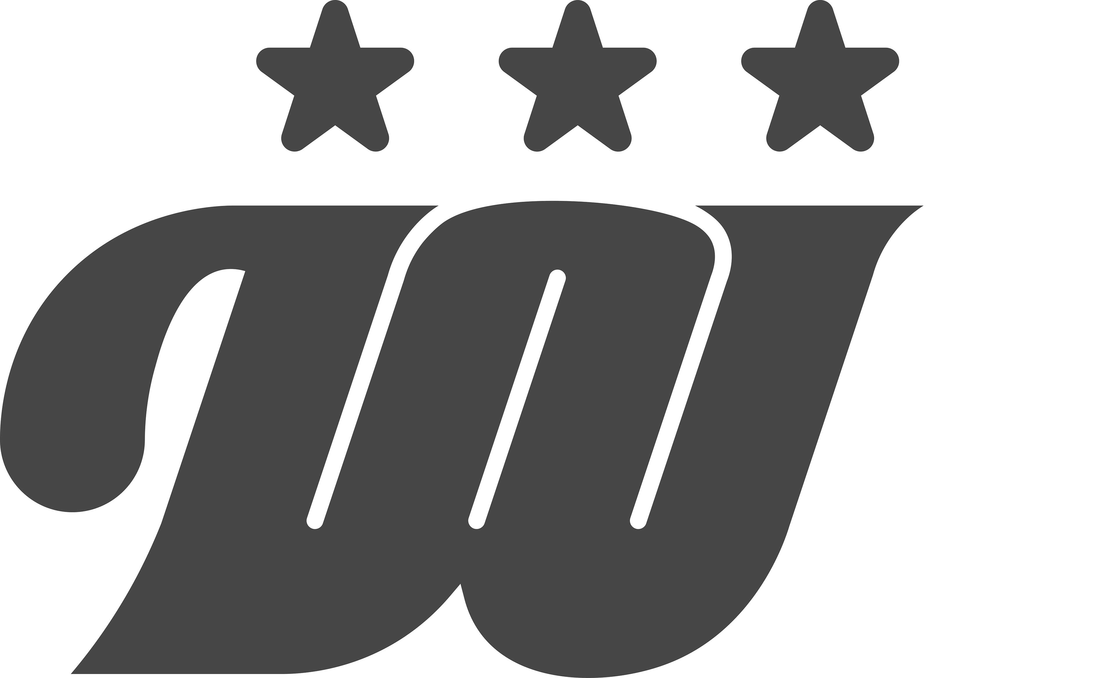
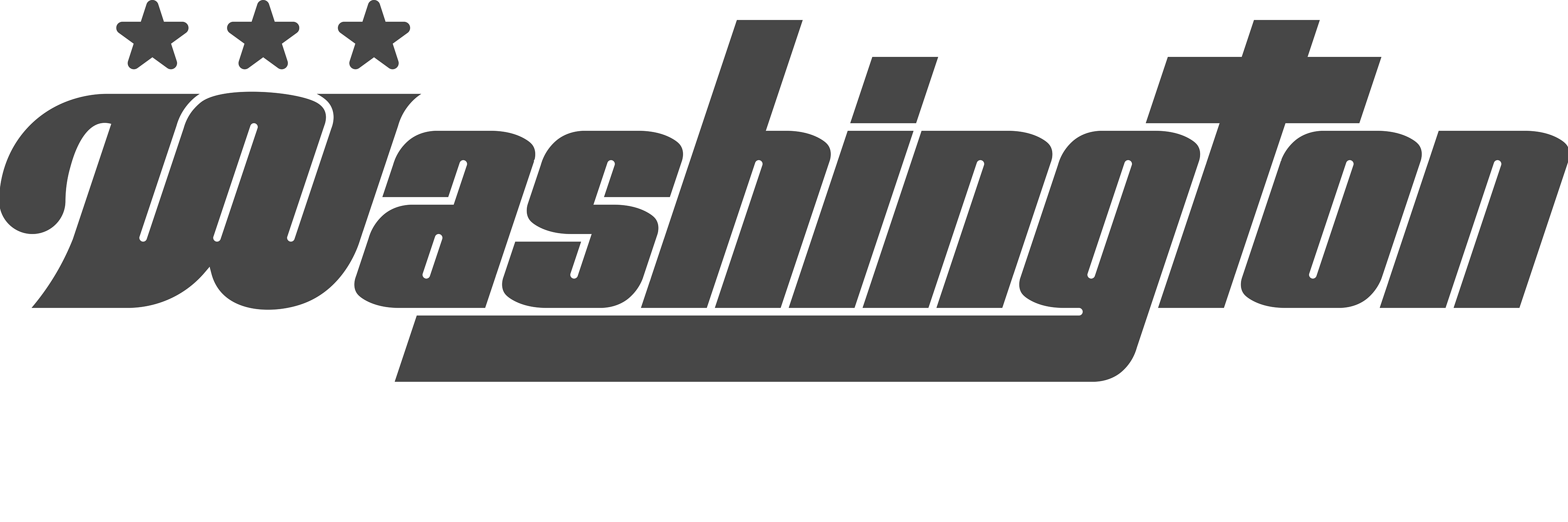
Washington Nationals Logo Redesign
I created this in my brand identity class (AVT 414) at George Mason University. We were given the task of recreating any logo we thought had a problem with it. As someone who grew up around baseball and loving the nationals, I had to show them some tough love and redesign their logo. I had an issue with the recognizability of the original design as it was commonly mixed up with the Walgreens logo. I gave it a modern look while also keeping older aspects such as the serifs and curl on the left side of the W, while also implementing new aspects like the three stars for the DC flag.
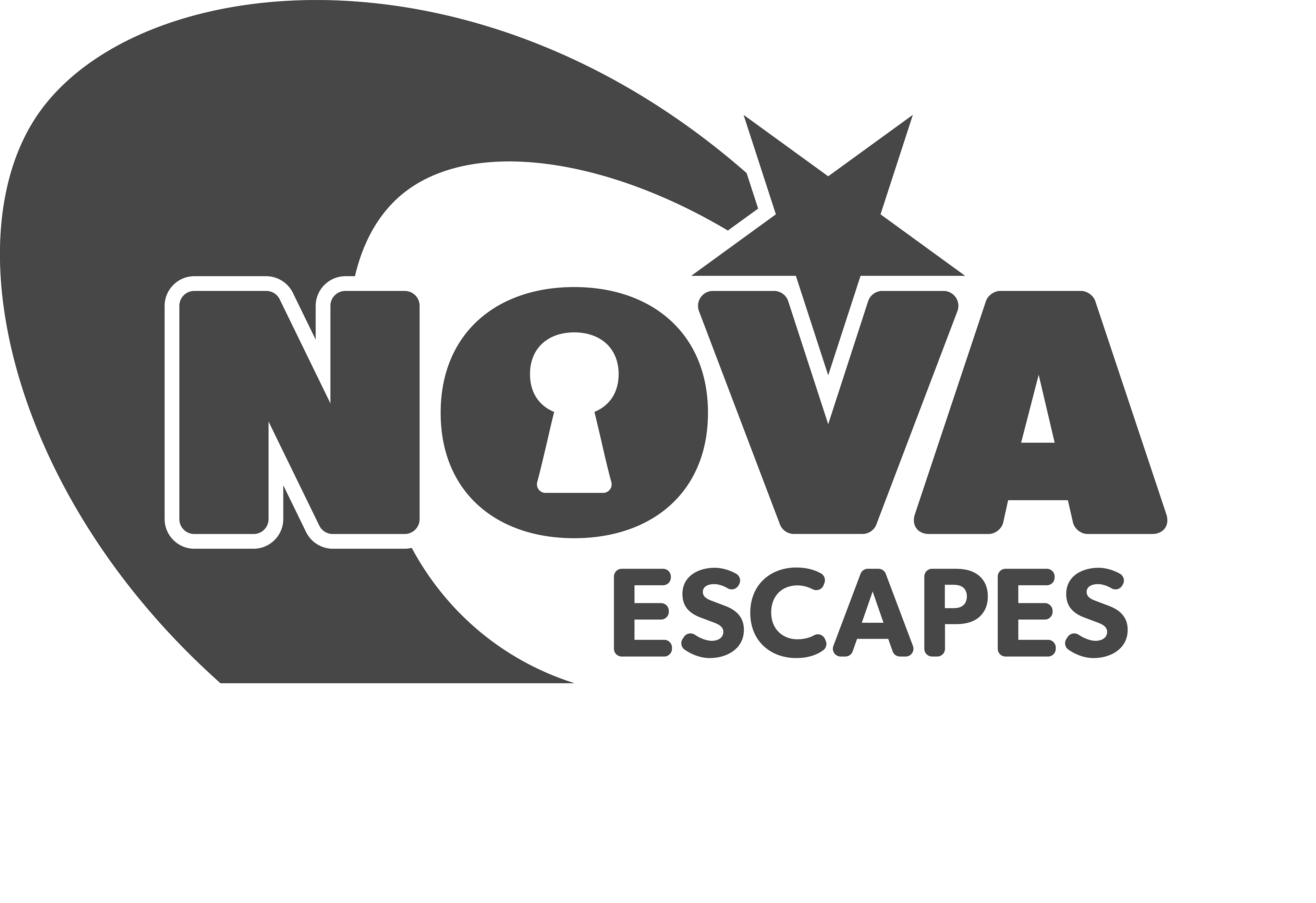
Nova Escapes
Nova Escapes is a local escape room company that has yet to open but is currently underway of being made; this is also my
first client work. I worked closely with the company's owner to create the perfect logo, which had a fast-moving and playful aspect and was tied together with a star to represent the nova
in Nova Escapes. One detail that I particularly like about this
logo is that the star matches perfectly with the V.

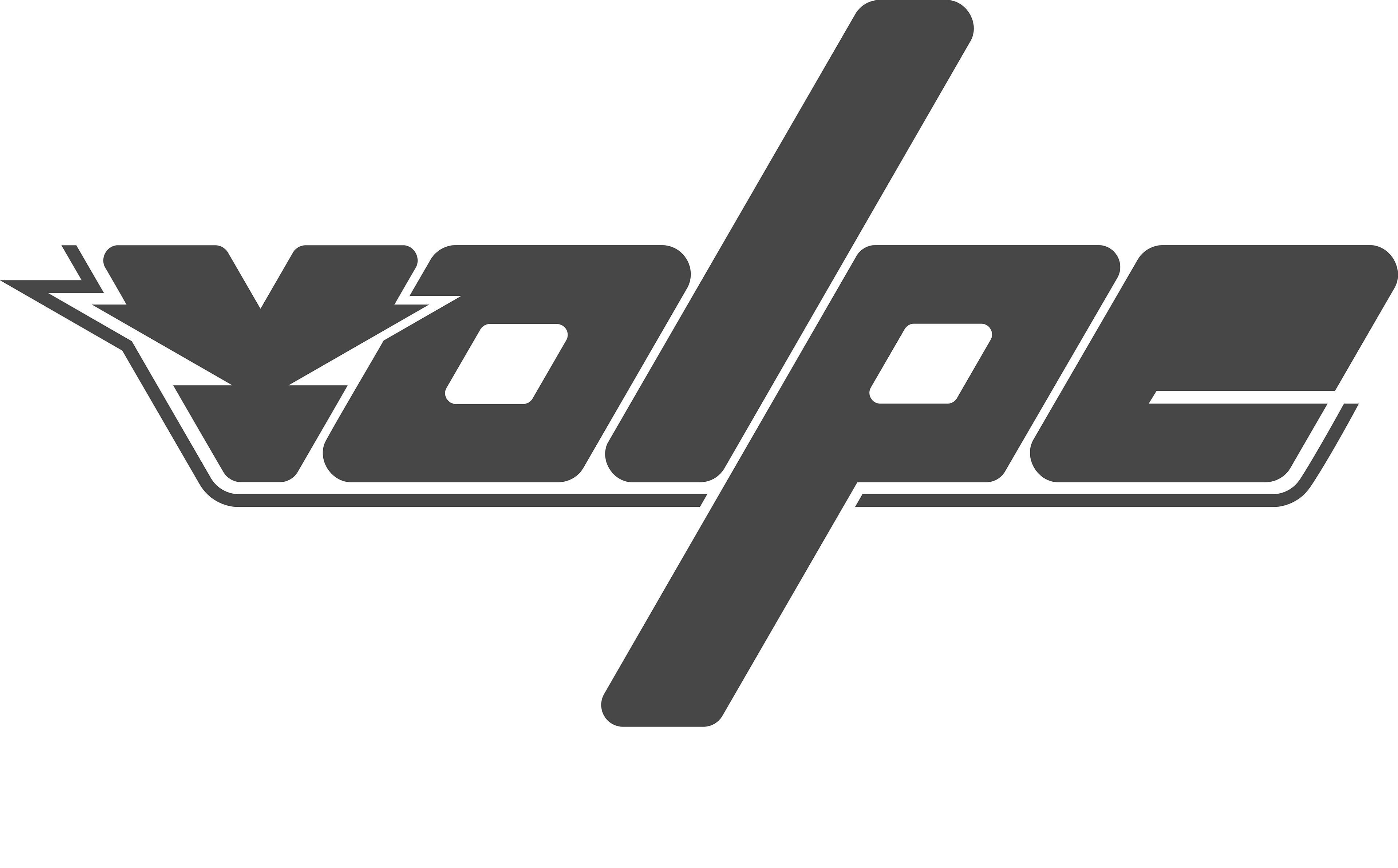
Volpe
Volpe was created in my graphic design method and principles class (AVT 311) at George Mason University. We were given the prompt to choose from a list of names to create a whole new brand out of it, and my word was Volpe or Fox in Italian. My brand idea was a cutting-edge winter clothing brand. The slogan was “Cool Clothes, Hot Fashion,” which I thought was very fitting. You can check out more of my work on this project in the “Brand Identity” tab where there is the business card, letterhead, brochures, and more.
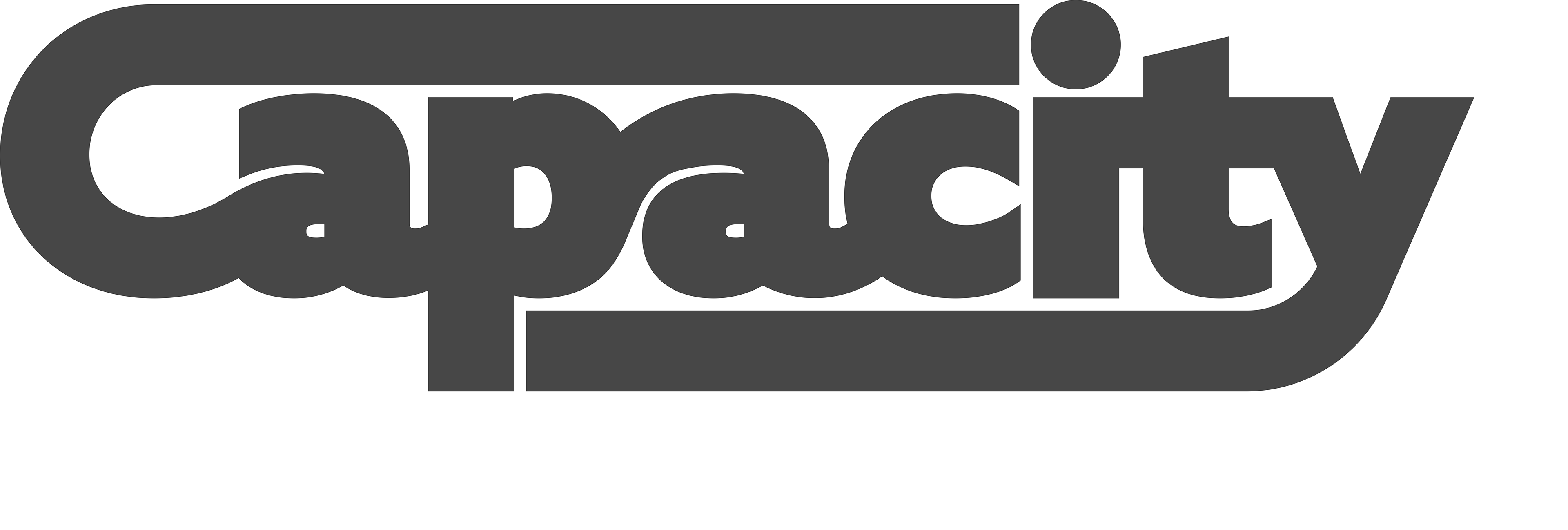
Capacity
Capacity is a music quintet located in Pittsburgh, PA. I did commission work for them for some time, which included designing a logo and poster for their Instagram page.