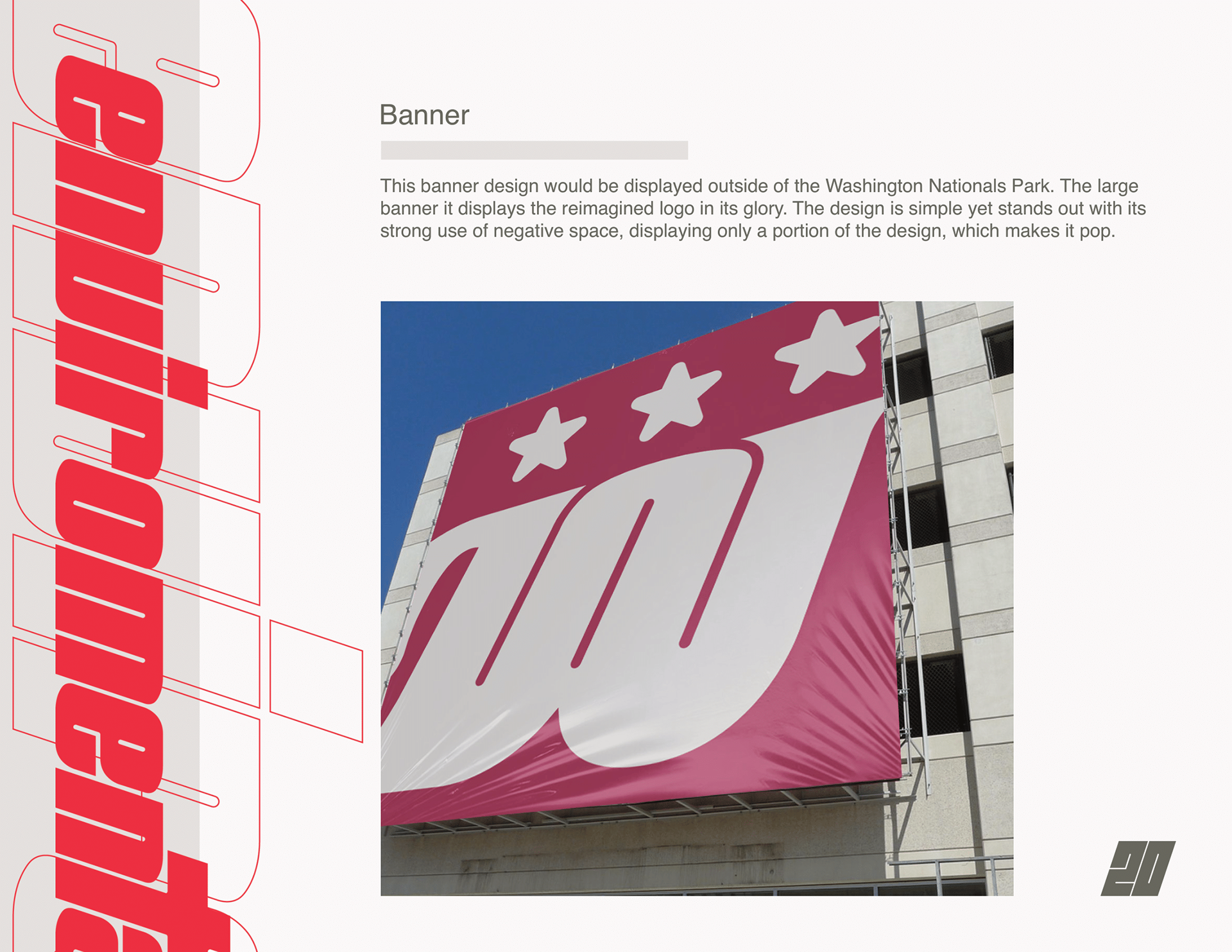
About the Project
In my Brand Identity Design class, we had to reimagine everything there is about a company, from the logo, to the company's identity, and its stationeries. In my final project, I focus on the Washington Nationals clothing, equipment, and environmental aspects of the company.
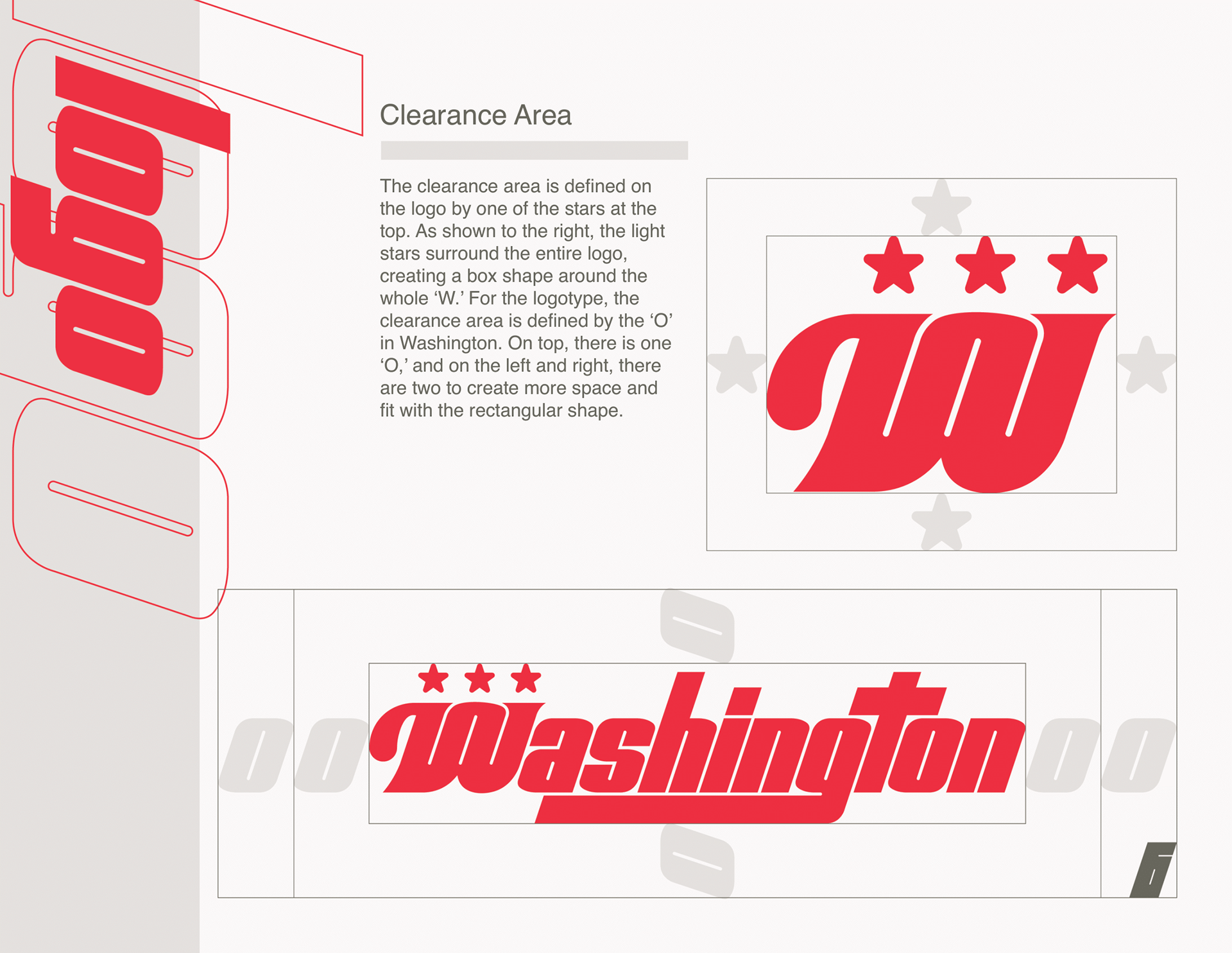
I chose the Washington Nationals because I grew up in a baseball-loving household and because the logo looks too similar to the Walgreens logo. With both companies being prominent in the DMV area, the similar curly W logo confuses many people, such as myself at times.
When designing the logo, I wanted to keep aspects of the former logo, such as the curl at the start of the W, and the loop in the center, while also implementing the DC pride. I accomplished this in sketch #2, as seen on the left side.
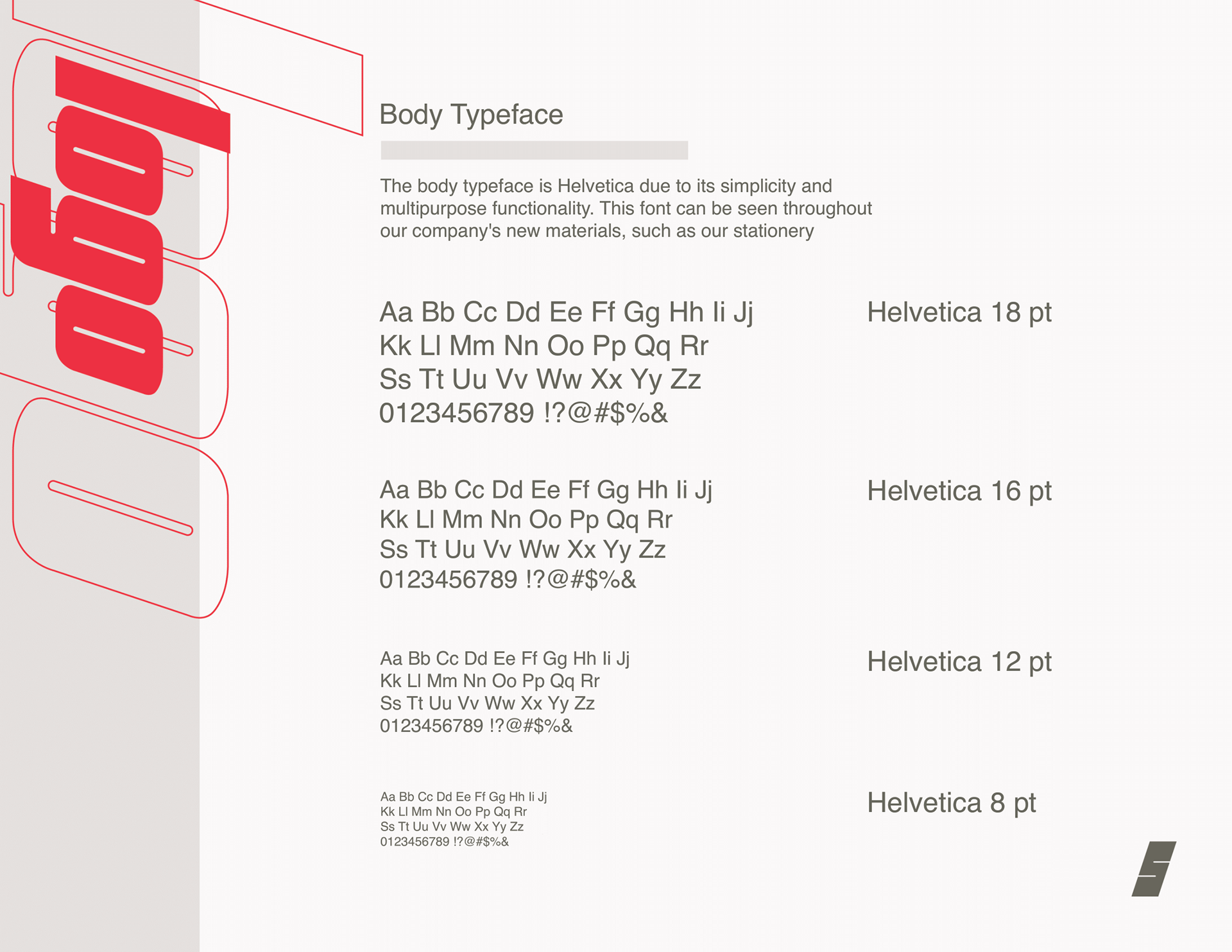
Another aspect of this project I am exceptionally proud of is the custom font I created. As seen on page 4, I made the English alphabet and numbers in the same style as the logo.